During my time at Princess Cruises, I was tasked with reimagining their airline booking tool.
Data Gathering and Initial Research
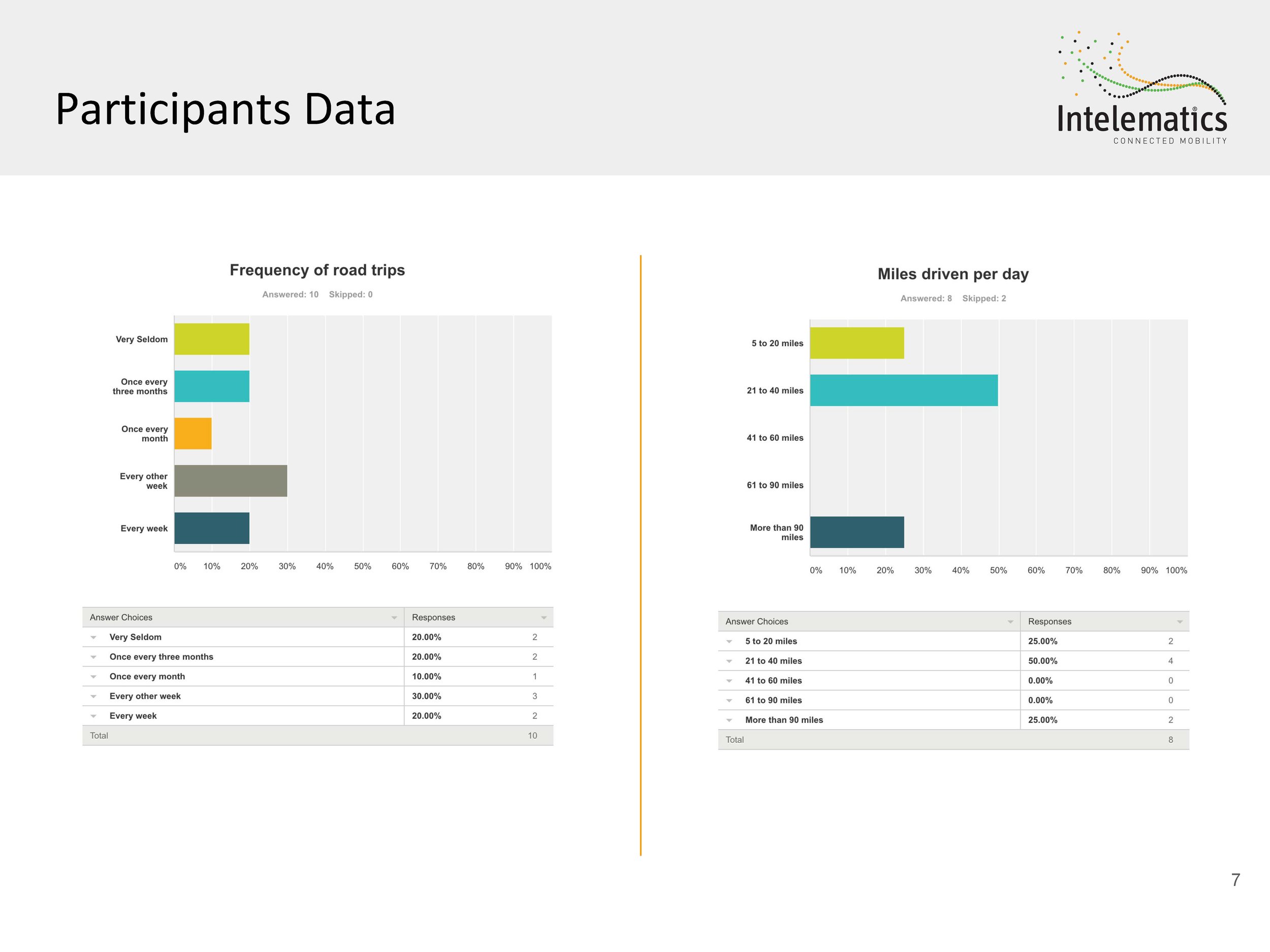
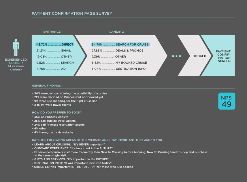
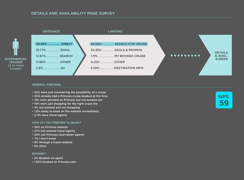
Starting with a comprehensive data collection effort, I looked at existing research, conducted user surveys, and performed competitive analysis to identify avenues for optimizing the flow and enhancing simplicity. Through customer intercept surveys, interviews with various stakeholders, and external travel agents, I was able to gather crucial insights to shape our direction.
Preliminary Findings:
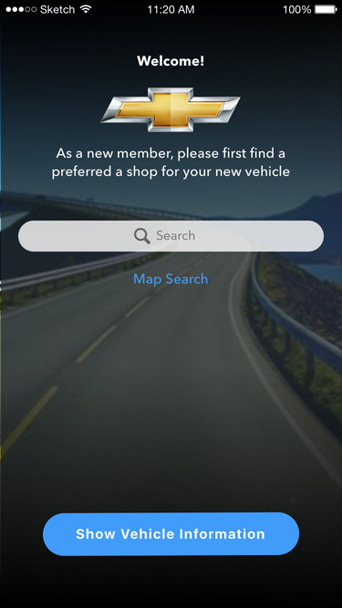
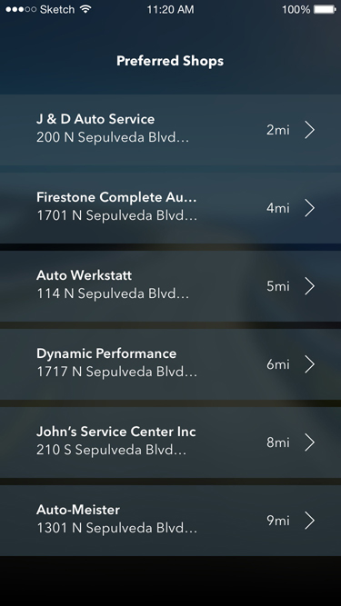
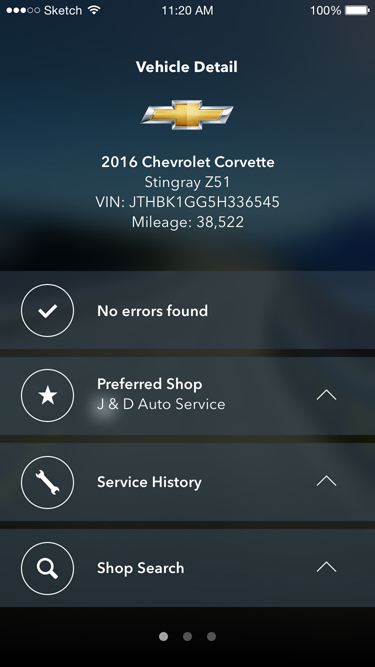
• From the user research, it became clear that the main problem with the tool was the way it handled the large amount of information that needed to be displayed. The site was cluttered and had poor visual content hierarchy making it difficult to scan and get to the essential information.
• After identifying business requirements, I concluded that adding more functionality would be an ongoing request so the new tool had to be flexible and modular enough to accommodate for future enhancements.
Personas
I identified our 3 main personas and they colored our team's decisions on design and functionality. Font size, color, and contrast choices were very influenced by the personas and the age of the users they represented.
Content Review
Before starting to rethink the flow we did a content review, listing all the information needed for every scenario. The goal was to eliminate redundancy and superfluous information. We also conducted content analysis focusing on hierarchy as well as making sure content was on-brand, accurate, and usable.
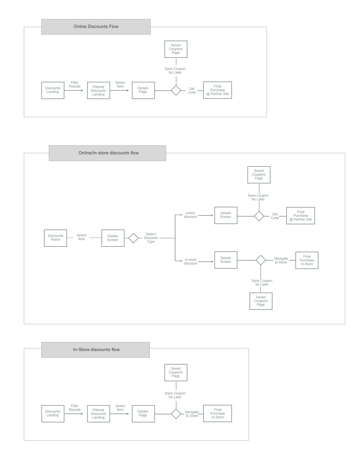
Flow:
Drawing insights from our earlier competitive analysis, I crafted representative user flows from the competition to benchmark our approach against industry standards. Despite having fewer steps in our flow, certain pages suffered from clutter, prompting us to introduce two additional screens to enhance the user experience.
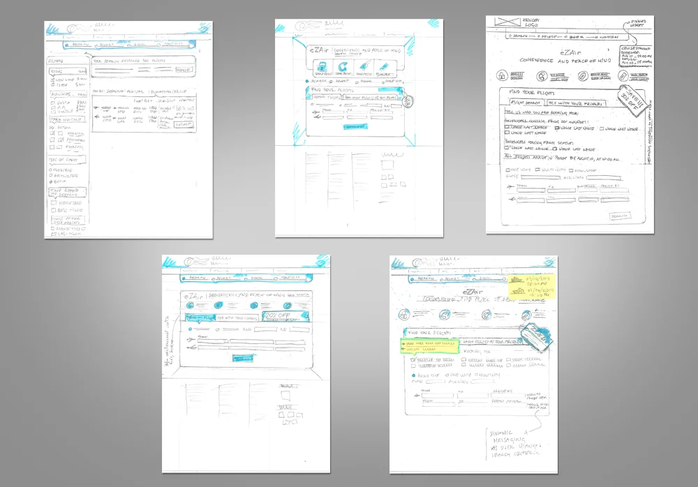
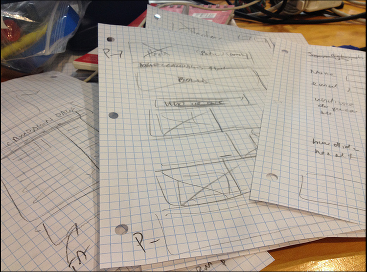
Sketches
With content streamlined, I began sketching main screens, iterating swiftly based on stakeholder feedback. These sketches served as a rapid consensus-building tool, aligning all stakeholders around our initial concepts.
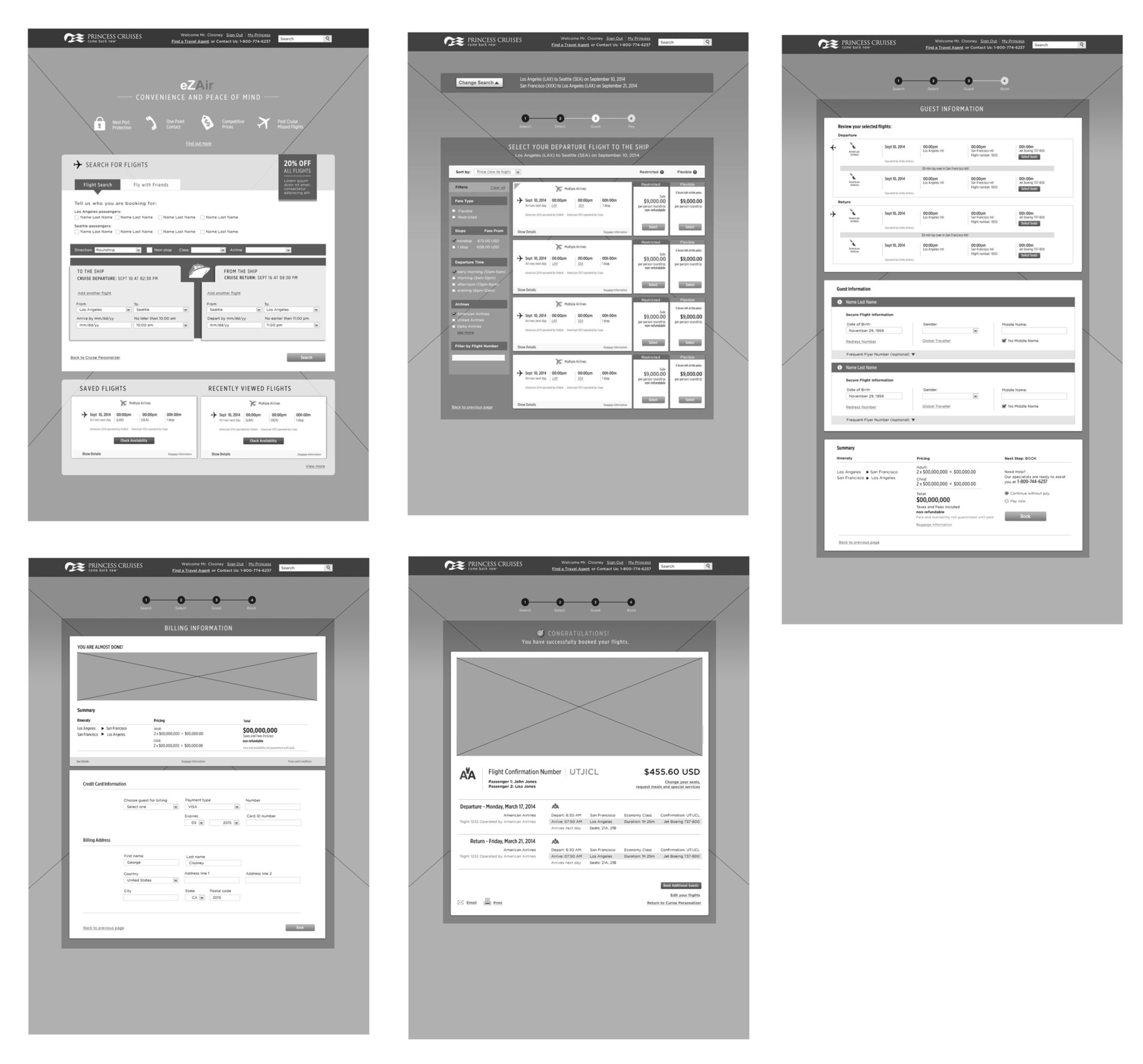
Wireframes
I created preliminary wireframes that were employed in our initial testing. Feedback from users helped us identify problem areas such as information overload. The findings led to alternative designs with graphical representations of flight information, enabling users to grasp essential information with just a glance.
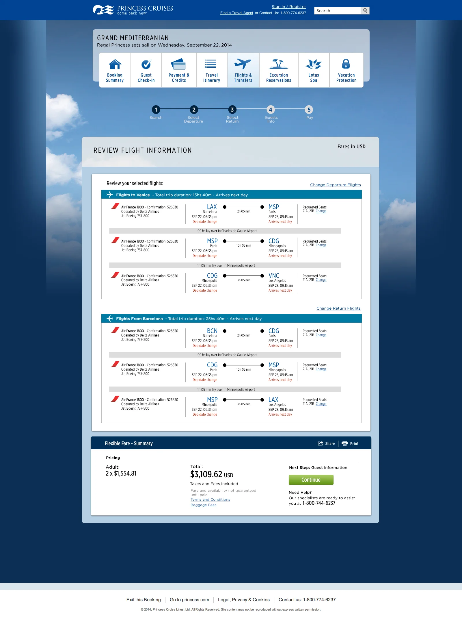
Interactive Prototype:
As layouts took shape, I transitioned to creating interactive prototypes using Axure. These prototypes proved invaluable for user testing, allowing us to evaluate different approaches to displaying fare types, prices, and other complex information.